A pilot would never judge an aircraft by looking at altitude alone.
The plane may be holding 35,000 feet perfectly while fuel pressure falls, an engine temperature rises or the aircraft begins consuming fuel faster than expected. Altitude matters, but without the other instruments it tells an incomplete story.
Application health has the same problem.
Teams often reach for one convenient number—99.9% uptime, average response time, crash rate, test coverage—and treat it as proof that the application is healthy. Each can be useful, but none can answer the larger question on its own.
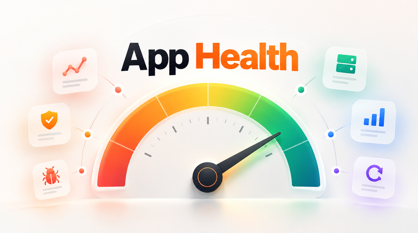
Measuring App Health means combining a small set of metrics that tell you whether users are getting the intended experience, whether the system can continue delivering it, and whether its condition is improving or deteriorating over time.
At Levelworks, App Health spans 17 aspects, from Observable and Secure through Performant, Scalable, Tested, Compatible and Seamlessly Updatable. Those aspects do not all reduce neatly to a single metric, nor should they.
The goal is not to create the biggest dashboard.
It is to measure the things that would change how you operate and maintain the application.
[Internal Link: “What Is App Health? 17 Signs of a Healthy Application”]
Before looking at CPU, memory or infrastructure, start with the reason the application exists.
Can users successfully complete its most important workflows?
For an ecommerce application, that might mean successful checkout rate. For a SaaS product, it could be successful login, file processing or completion of a core workflow. An internal application might care about successfully processed orders, approved requests or completed data jobs.
These are sometimes described as business or service-level indicators because they measure the application from the user's or business's perspective.
AWS's reliability guidance explicitly recommends monitoring KPIs tied to business value rather than relying only on infrastructure metrics. A service can be technically available while the function users depend on is failing.
AWS Well-Architected: Monitor Workload Health
A useful starting set is:
These measures help prevent a common mistake: declaring the application healthy because its infrastructure is green.
The number of open bugs is a poor operational health metric.
A backlog might contain 200 low-impact cosmetic issues while production is stable, or only ten defects while one recurring error disrupts thousands of transactions.
What matters more is how frequently the running application fails and where those failures occur.
Google's Site Reliability Engineering guidance identifies errors as one of the four “golden signals” for monitoring user-facing systems, alongside latency, traffic and saturation. It also notes that errors can take different forms, including explicit failures such as HTTP 500 responses and incorrect behaviour that may require application-specific measurement.
Google SRE: Monitoring Distributed Systems
Useful measures include:
Trend matters more than one isolated number. If the application normally sees 0.2% failed requests and that rises steadily to 0.8%, the direction may matter even before the team decides the absolute level is unacceptable.
For Levelworks, these measures provide evidence around the Error Free aspect of App Health, while the ability to see and diagnose those errors also connects to Observable and Explainable & Debuggable.
“Average response time is 400 milliseconds” sounds useful until you discover that most requests take 150 ms while a meaningful group of users waits several seconds.
Averages hide the tail of the distribution.
AWS recommends looking closely at latency outliers such as the 99.9th percentile because acceptable averages can coexist with a consistently poor experience for a minority of requests.
That is why application-performance dashboards often include:
The exact percentile worth tracking depends on the application. A high-volume payment system may care deeply about p99 behaviour, while a lower-volume internal tool might gain little from an extremely high percentile.
The principle is simply to avoid allowing averages to hide users who are having a much worse experience.
Backend latency does not tell the whole story for a web application.
Google's Core Web Vitals measure three aspects of real-world user experience:
Google currently classifies LCP of 2.5 seconds or less, INP of 200 milliseconds or less, and CLS of 0.1 or less as “good,” evaluated at the 75th percentile of page visits.
Google: How Core Web Vitals Thresholds Are Defined
These benchmarks are useful for web experiences, but they should not become generic performance targets for every kind of application.
Apple's production tooling shows why performance metrics must match the platform. Xcode can surface real-world information on launch time, memory use, interface responsiveness, battery impact and other characteristics across shipping versions.
Apple: Analyzing the Performance of Your Shipping App
The useful metric is the one that reflects the experience your users actually receive.
[Internal Link: “App Health vs App Performance: What’s the Difference?”]
An application may be healthy at current demand while operating dangerously close to its limits.
Google SRE calls this saturation: how close a service is to a constraint such as memory, CPU, storage, connections or another finite resource.
Capacity metrics worth watching might include:
Resource
Useful health signal
CPU
sustained utilisation and peak behaviour
Memory
consumption trend, pressure and termination risk
Database
storage growth, connections, query load
Queues
depth and time waiting for processing
Disk/storage
utilisation and rate of growth
External APIs
quota or rate-limit consumption
Worker pools
utilisation and backlog
Do not treat “CPU under 80%” as a universal health rule. The constraint that matters depends on the architecture.
More useful questions are: How much headroom do we have, how quickly are we consuming it, and what happens when we reach the limit?
Those measures make the Scalable and Performant aspects of App Health more concrete.
A healthy application is not one that never experiences failure. It is one that can recover at a speed appropriate to its importance.
Two useful categories of recovery metrics are:
How long does it take to return the application to normal after a production failure?
Google's DORA framework includes failed deployment recovery time—historically described as time to restore service—as an important measure of software-delivery stability. DORA also tracks change failure because reliability depends not only on whether failures occur, but on how quickly teams can recover when they do.
Google Cloud: DORA Software Delivery Metrics
For important applications, teams may also define:
These targets are useful only if recovery is actually tested. A backup existing somewhere is not itself a measure of recoverability.
For the Levelworks App Health model, these metrics provide evidence around Resilient rather than simply showing whether the application has experienced an outage recently.
Some applications look healthy until somebody tries to change them.
If every second release creates an incident, routine dependency upgrades are delayed because production changes are frightening, or recovery after a bad deployment takes hours, the application has a health problem even if today's uptime is excellent.
This is where software-delivery measures become useful.
DORA's commonly used measures include:
Google describes deployment frequency and lead time as measures of throughput, while change failure and recovery time reveal stability.
For App Health, the most relevant measures are often change failure rate and recovery time, because they tell you how safely the system can evolve.
Deployment frequency alone is not a health metric. An application releasing twice a day is not automatically healthier than one releasing twice a month.
What matters is whether changes can be delivered at the pace the business needs without repeatedly destabilising production.
This provides useful evidence for Levelworks' Tested, Version Controlled and Seamlessly Updatable aspects.
A modern application may depend on a payment gateway, authentication provider, CRM, email service and several APIs. A dashboard covering only your own services can therefore show green while a critical user journey is broken.
For important integrations, measure:
You may also need non-numeric indicators such as API version support and upcoming deprecation dates.
This matters because Integrable App Health has two dimensions: whether the connection works technically today and whether it remains supportable as the external service changes.
“Zero security incidents this quarter” does not prove an application is secure.
A better security-health view includes indicators such as:
These metrics require context. Twenty low-risk dependency findings may deserve less attention than one exposed vulnerability affecting authentication.
The same principle applies to the Current & Updated aspect of App Health. Counting outdated packages alone is not especially useful; knowing that the application relies on a business-critical framework approaching end-of-support is much more actionable.
Not every application problem generates a clean system metric.
Users may complete a workflow successfully while repeatedly needing support to understand it. A feature may technically function but generate a growing number of complaints or manual workarounds.
Useful signals can include:
These should not automatically be interpreted as engineering failures, but they can reveal deterioration in User Friendly & Delightful and Supported that infrastructure monitoring will never show.
The goal is to connect technical measures with what users actually experience.
Not everything deserves a time-series graph.
For aspects such as Well Documented, Compatible, Compliant or parts of Tested, periodic evidence can be more meaningful than continuous numbers.
Examples include:
App Health question
Better evidence
Is recovery dependable?
Successful recovery exercise
Is documentation current?
Periodic review against production
Is browser support healthy?
Compatibility test against defined support matrix
Is a deployment reversible?
Tested rollback procedure
Is the application compliant?
Evidence against applicable requirements
Is important functionality tested?
Reliable test results for critical workflows
Trying to force every aspect into a numerical score can create false precision.
A documentation score of 82 does not tell you nearly as much as discovering that nobody has written down how a business-critical integration is recovered.
Some metrics look impressive while answering very little.
99.99% uptime is irrelevant if checkout is failing while the homepage remains available.
An acceptable average may hide terrible tail performance for a meaningful group of users.
Teams can close many low-impact bugs while a small number of recurring production problems remain unresolved.
Coverage tells you how much code was executed by tests, not whether the important behaviours are properly protected.
More alerts can indicate better instrumentation or simply a noisier monitoring setup.
Releasing more frequently is useful only when it supports the business without damaging stability.
A metric is valuable when a movement in that metric can lead to a meaningful decision.
If nobody knows what they would do differently when a number changes, it probably does not deserve prominent space on the App Health dashboard.
A single reading has limited value.
Suppose p95 API latency is 720 ms. Is that healthy?
Without context, it is difficult to say.
If the same endpoint was 400 ms three months ago, the trend is concerning. If it was 1.2 seconds before a recent optimisation, the direction is positive.
Good health measurement therefore compares:
Apple's performance tooling follows exactly this logic by allowing teams to examine production metrics across app versions and device models so regressions can be identified rather than judged from an isolated number.
App Health is partly a question of condition, but it is equally a question of direction.
There is no universal dashboard, but for many production applications a useful first version would contain roughly these signals:
Area
Example measure
Critical functionality
workflow success rate
Availability
critical-service availability
Reliability
user-impacting error rate
Performance
p95/p99 latency or relevant user-performance metric
Capacity
utilisation/headroom of the primary constraint
Recovery
failed deployment recovery time / incident recovery time
Release health
change failure rate
Integrations
success and timeout rate for critical dependencies
Security
unresolved material vulnerabilities / patch age
User experience
recurring support or usability signal
That is deliberately smaller than many monitoring setups.
Teams can still collect hundreds of technical metrics underneath. The App Health view should surface the few measures that tell decision-makers whether the condition of the application is changing.
[Internal Link: “What Should an Application Monitoring Dashboard Track?”]
The easiest way to choose App Health metrics is to start with the decision you are trying to make.
Can users complete the application's job?
Measure workflow success and errors.
Is the experience deteriorating?
Measure latency and user-facing performance over time.
Can the system handle growth?
Measure saturation, capacity and demand.
Can we recover from failure?
Measure recovery time and test recovery procedures.
Are releases making the application less stable?
Measure change failure and compare health across releases.
Are external dependencies becoming risky?
Measure integration success and track support/deprecation status.
Are security risks accumulating?
Measure relevant vulnerability exposure and remediation time.
Once the question is clear, the metric becomes easier to choose.
There is an understandable appeal in reducing App Health to a single number.
App Health: 87/100.
It is easy to communicate, compare and put on a dashboard.
The danger is that aggregation can hide exactly what decision-makers need to see. An application might perform extremely well on availability, performance and documentation while carrying a serious security weakness. Averaging those dimensions together could make the overall score look reassuring.
At Levelworks, the more useful approach is to measure each health dimension with evidence appropriate to that dimension and then look at how the pieces interact.
A rising error rate alongside worsening p95 latency may indicate something very different from either metric moving alone. An ageing framework matters more when it is also preventing security patches or making releases difficult.
The point of measuring App Health is not to produce more numbers.
It is to make deterioration visible early enough that teams can act while the problem is still manageable.
A healthy measurement system should ultimately help you answer three questions:
What is happening to the application now?
Is its condition improving or deteriorating?
Where should we pay attention next?
If your metrics can answer those questions, they are probably the ones that actually matter.