

First Cheque

Crafting a clear and confident web presence for a founder-first VC

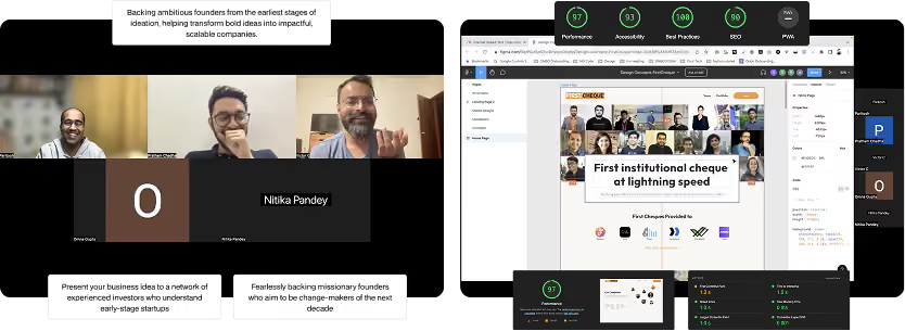
First Cheque is a founder-focused investment and startup ecosystem platform built to help early-stage founders discover opportunities.

In the fast-moving world of early-stage startups, our team collaborated with First Cheque to reimagine the digital presence of their founder-first investment platform.

This collaboration helped establish a stronger brand voice, improve discoverability across the platform, and create a more engaging website experience that better reflected the ecosystem, opportunities, and value offered to early-stage founders.
Committed to developing and upholding sustainable practices
We believe that the built environment plays an important role in achieving these goals
Committed to developing and upholding sustainable practices
Problem
The website lacked the founder-friendly experience that defined the brand. The outdated digital presence failed to clearly showcase the USP's, ecosystem, and opportunities available to founders.
How might we?
1
Conduct effective and efficient discovery
2
Evaluate what’s working and what isn’t in the current setup
3
Identify key brand values and voice
4
Study the broader ecosystem to understand peer strategies and positioning
5
Redesign by balancing best practices with creative ambition
6
Validate holistically that the outcome meets strategic and user expectations

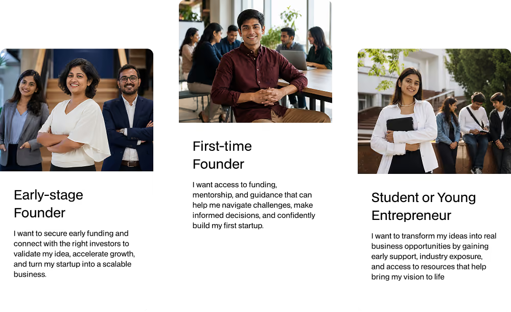
Who we solved for

Conduct effective and efficient discovery

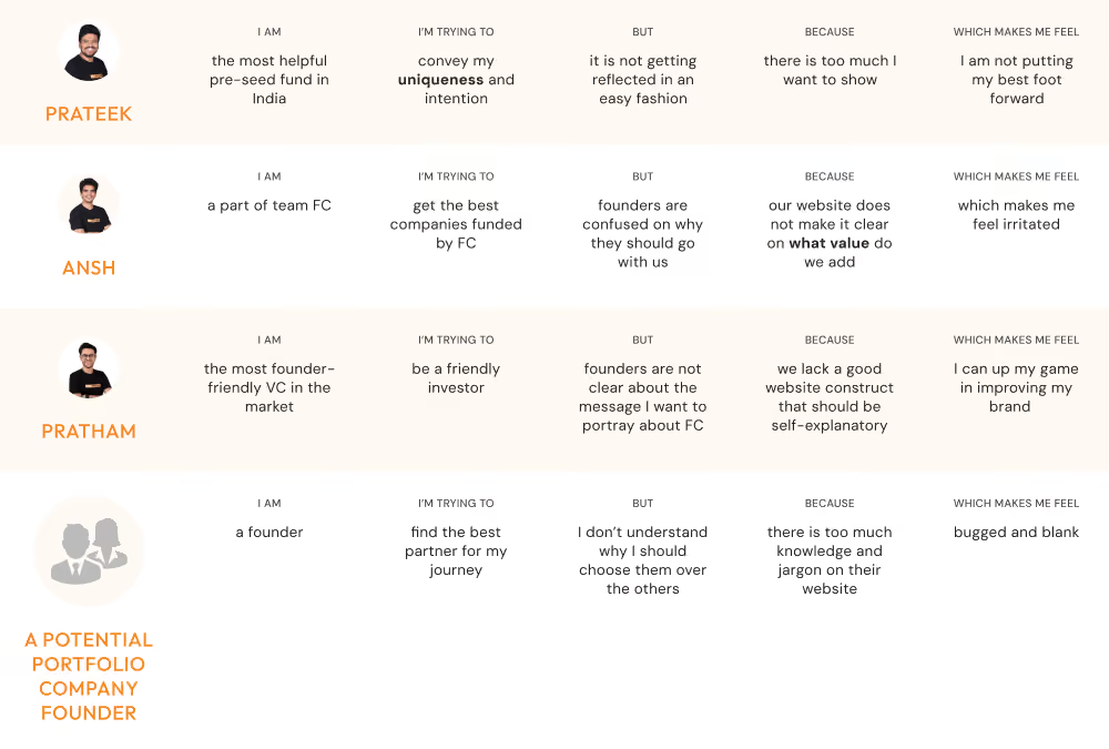
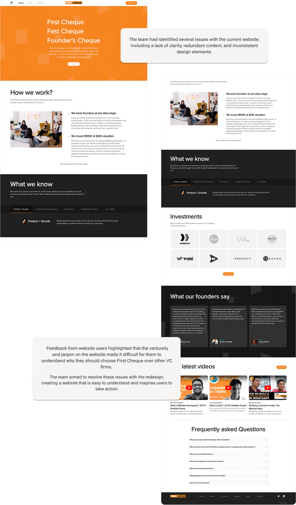
We evaluated the existing website experience to identify gaps across messaging, visual consistency, usability, and overall founder discovery journeys. The analysis focused on understanding how users interacted with the platform, how the overall experience could better reflect the approachable and founder-first nature of the brand.

This process helped uncover inconsistencies in positioning, structure, and storytelling that were limiting engagement. We restructured the homepage to focus on clarity for founders to understand what First Cheque offers, who it’s for, and how to engage. Visitors are introduced to the fund’s value, focus areas, and real portfolio examples, all crafted to resonate with early-stage founders. The redesign helped shift the experience from passive browsing to active interest, giving users a stronger reason to stay, explore, and connect.

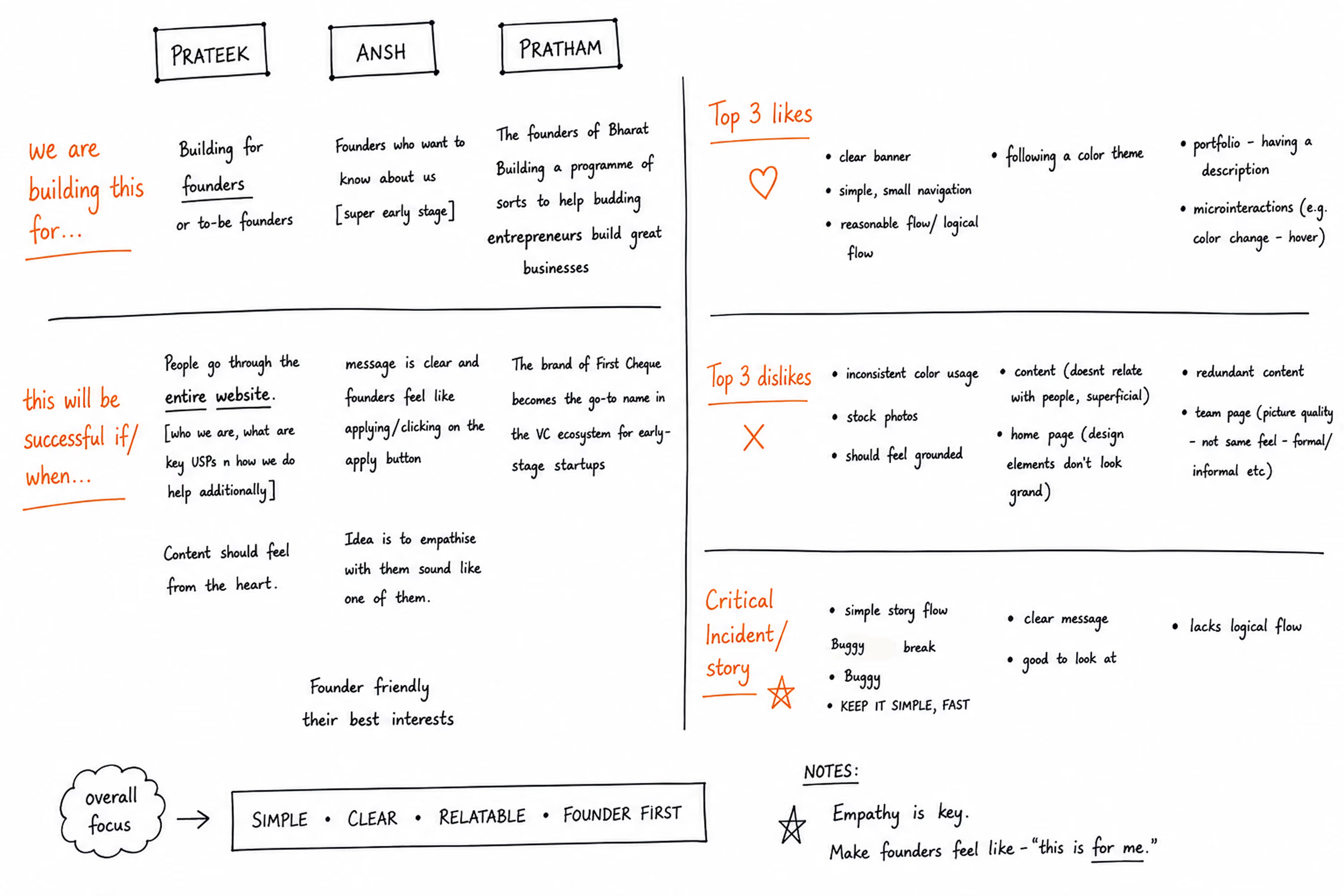
Notes from Brainstorming workshop

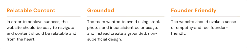
conclusion

Evaluate what’s working and what isn’t in the current setup

Before starting the redesign, we conducted a thorough evaluation to understand which parts of the existing site were effective and where users were facing friction. This helped ensure that our decisions were rooted in real user insight rather than assumption.

To do this, we adopted a layered review approach. A free-flow evaluation helped surface immediate first impressions while Critical Incident Technique allowed us to isolate moments where users felt lost or particularly engaged. We also used a spider plot framework to map performance across areas like tone, navigation, clarity, and visual hierarchy. This mix of qualitative and structured analysis revealed recurring issues such as excessive jargon, inconsistent design patterns, and lack of clarity.

Identify key brand values and voice

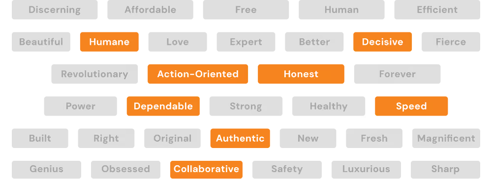
Many early-stage founders visiting the platform were often unfamiliar with what First Cheque offered beyond being an investment firm. The existing website lacked a clear brand voice, founder-friendly communication, and a structured discovery experience, making it difficult for users to fully understand the ecosystem and opportunities available to them.

We identified the need for a more approachable and human-centric digital presence. This led to the use of real imagery, authentic messaging, and a relatable visual direction that felt more aligned with the journey of early-stage founders. The result was a clearer, more engaging website experience that improved discovery, strengthened the brand voice, and created a stronger connection with founders.

Journey Mapper - Overview
Transforming Alternative Education | Lateshia Woodley | TEDxDecatur
Journey Mapper - Overview
Transforming Alternative Education | Lateshia Woodley | TEDxDecatur

Study the broader ecosystem to understand peer strategies and positioning

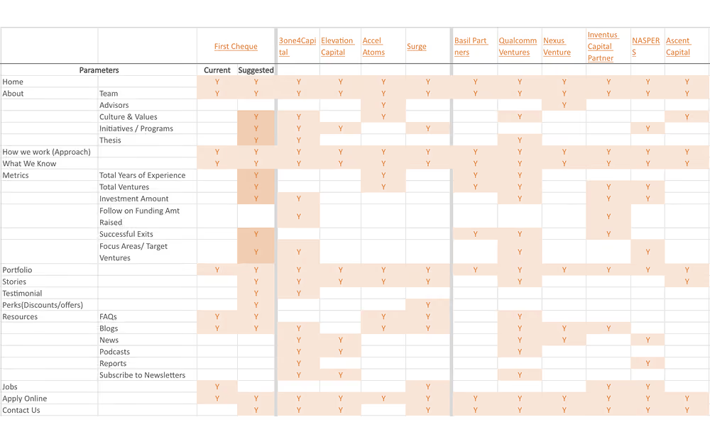
To understand how First Cheque could stand out, our team conducted a detailed analysis of peer websites across the startup investment ecosystem. The goal was to identify common patterns, gaps, founder expectations, and messaging approaches used by leading venture capital platforms. This helped us understand how competitors communicated trust, showcased their ecosystem, and guided users through discovery journeys.

By mapping features, content structures, and communication styles across competitors, we identified opportunities for First Cheque to differentiate itself through a more approachable, founder-friendly, and human-centric experience. These insights influenced key redesign decisions and overall website structure, helping create a digital presence that felt more relatable, and aligned with the needs of early-stage founders.

Redesign by balancing best practices with creative ambition

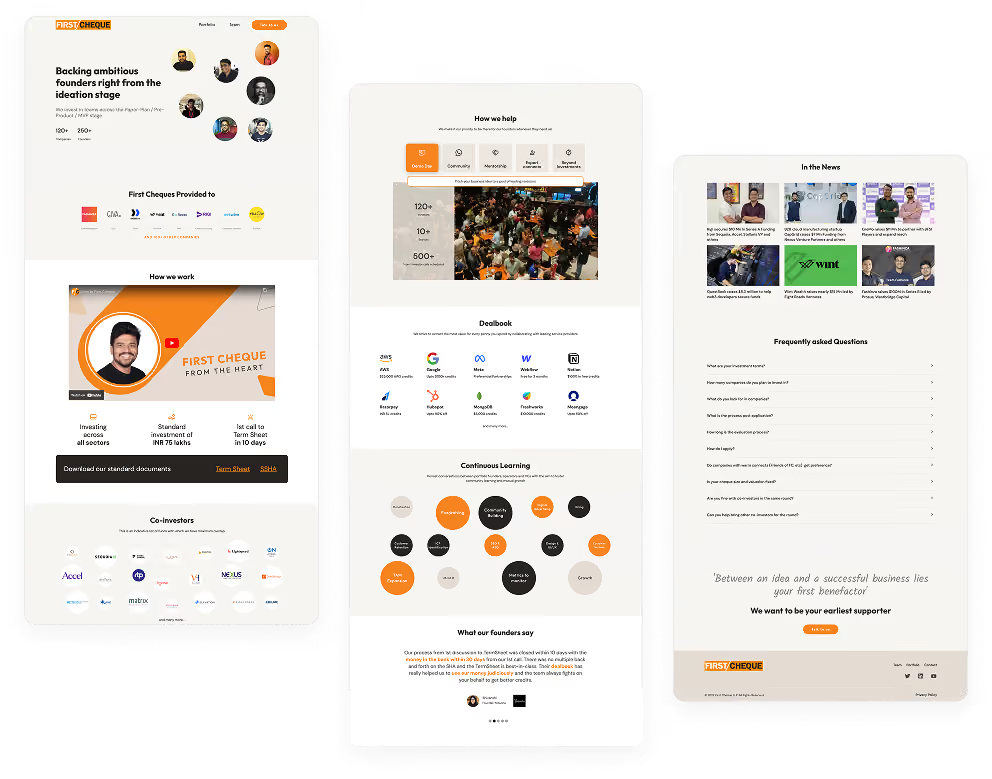
We set out to create a redesign that balanced established UX patterns with warmth, creativity, and brand authenticity. The experience was designed to feel intuitive and inviting, with clear messaging replacing jargon and a more approachable, conversational tone that better reflected the brand’s values.

Clearer calls to action and intentional content flows were introduced to improve guidance and engagement across the website. Elements like real team imagery, founder stories, and narrative-driven content added authenticity and relatability to the experience. The redesign was crafted to create a platform that felt credible, and distinctly founder-first.

Validate holistically that the outcome meets strategic and user expectations

To gauge the effectiveness of the redesign, structured user testing sessions were conducted to identify key friction points such as unclear messaging, underwhelming calls to action, and opportunities to make the site more dynamic. The team used these insights to pinpoint exactly where users hesitated or lost clarity.

Based on this feedback, the team made focused improvements. The language was simplified further to make it more approachable. The placement and design of the call to action on the homepage were refined to improve visibility and flow. Interactive design elements were also added to boost engagement and bring a sense of playfulness. Additionally, Performance was also optimized to ensure the site remained fast and responsive across devices. These refinements contributed to a final site that effectively communicates First Cheque’s brand voice.

Create an intuitive and engaging user experience?

A well-designed platform should minimize friction, allowing users to navigate effortlessly and complete tasks without confusion. One of the biggest challenges in educational discovery is that users—whether parents, students, or educators—often encounter cluttered interfaces, inconsistent navigation, and overwhelming information, making it difficult to find relevant learning centers and approaches. A confusing experience can lead to frustration and disengagement, ultimately reducing the platform’s effectiveness.

To address this, the platform is built with clarity, simplicity, and engagement at its core. A structured layout, intuitive navigation, and accessibility across devices ensure that users can browse, filter, and compare learning centers with ease. By prioritizing user needs, the experience remains seamless and frustration-free, making the process of discovering educational opportunities both intuitive and enjoyable.

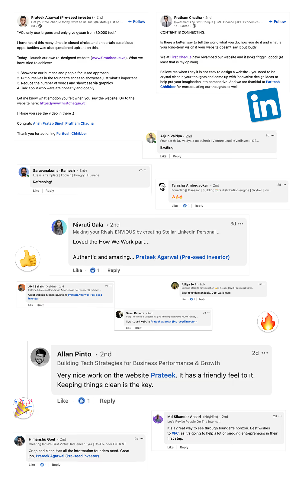
Founders and internal stakeholders alike reported greater clarity, engagement and confidence

Founders, team members, and partners could now interact with the platform more easily, helping them discover opportunities, explore the ecosystem, and engage with the brand more seamlessly.
3x
More founder friendly
40%
Higher interaction across key website sections
5x
More aligned to brand goals
Educator
Admin
Management
Content
Operational
Authentic
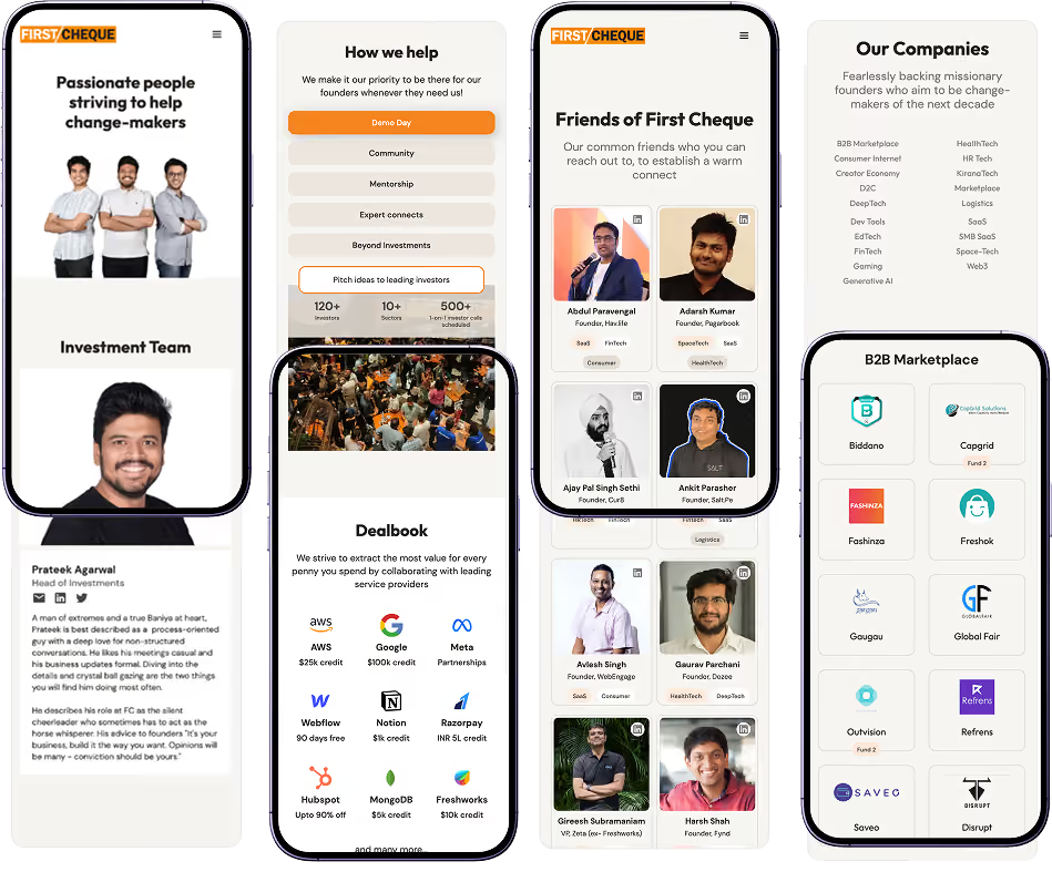
The redesigned experience helped First Cheque communicate with founders in a more genuine, relatable, and human way. The website moved away from generic VC aesthetics in favor of a more grounded and founder-first approach that felt approachable from the very first interaction. Conversational messaging replaced overly formal language, while real imagery, team profiles, and founder stories added more depth, personality, and relatability to the experience.

This helped the brand feel more credible, transparent, and community-driven, allowing founders to engage with the platform more comfortably and confidently.
Relatable
The website was designed around the real needs and journeys of early-stage founders, making the experience feel more intuitive, approachable, and easy to understand. Clear messaging, real portfolio examples, founder-focused content, and thoughtful calls to action created a stronger sense of familiarity and relevance across the platform.

Instead of feeling overly formal or corporate, the website felt more supportive and aligned with the realities of building a startup. Founders could now navigate the platform more naturally, explore the ecosystem with ease, and better understand how First Cheque could support them.
Credible
The redesigned website helped build stronger trust and credibility by showcasing the real people, startups, and ecosystem behind First Cheque. Real team imagery, portfolio representation, founder stories, and media mentions created a more transparent and authentic experience that felt grounded and trustworthy.

Instead of relying on generic investment platform visuals, the website focused on real proof points and authentic storytelling. This helped First Cheque feel more established, active, and founder-focused, creating a stronger impression and greater confidence among users from the very first interaction.
Client Experience
“Paritosh & team captured our intent, spirit, the emotions we wanted to evoke & translated it into great designs. They took the time to understand who we were, the personality of First Cheque & used it to form the foundation for design decisions. At each step, we could see how skilfully they struck a balance between what we wanted and the tenets of good design.”
Prateek Agarwal
Investment Lead, First Cheque (2022 - 2024)
Backing early-stage startups

More Case Studies